Table of Contents
- Simplify the Checkout Process
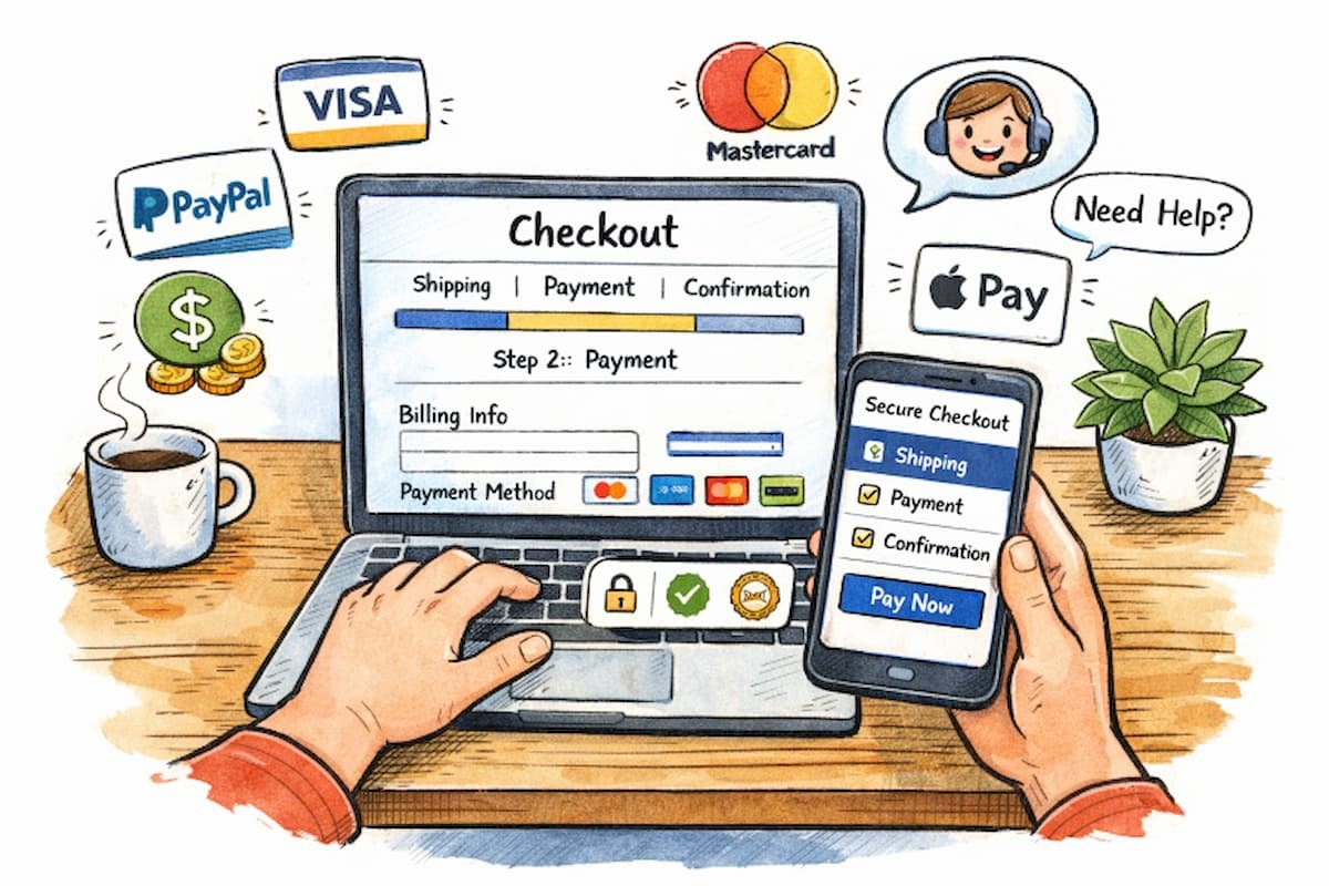
- Implement Progress Indicators
- Optimize for Mobile Users
- Offer Guest Checkout Options
- Integrate Multiple Payment Methods
- Enhance Form Usability
- Display Clear Error Messages
- Incorporate Trust Signals
- Provide Accessible Customer Support
- Conclusion
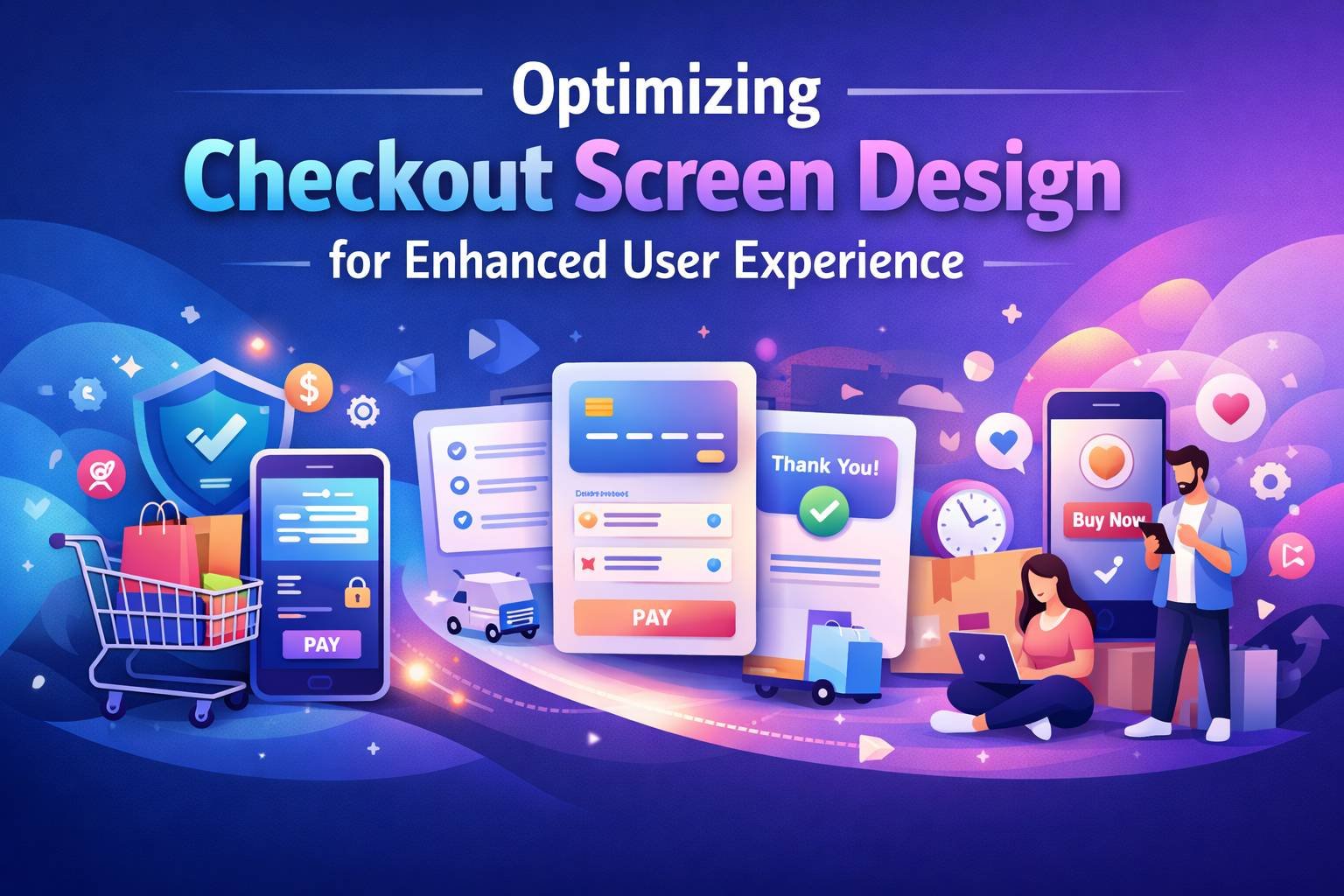
As e-commerce continues to evolve, the checkout process remains the final gateway between customer intent and a completed purchase. For users, this phase is often where excitement turns into hesitation; any small obstacle can alter their decision to buy. Businesses that prioritize a streamlined and intuitive checkout experience can minimize abandonment and boost conversions. Studying well-executed checkout screens can offer valuable insights into current best practices. Effective checkout screen design does more than speed up the process; it builds trust, reduces errors, and addresses the diverse needs of shoppers. Whether browsing on desktop or mobile, customers expect efficiency and clarity at every step. The path from shopping cart to order confirmation should be as simple and reassuring as possible, especially as the digital shopping landscape grows ever more competitive.
To create a stellar checkout experience, designers must anticipate common pain points and implement proven solutions, from progress indicators to customer support. These optimizations not only enhance the user experience but can have a profound impact on a company’s bottom line. Below, this guide explores actionable strategies for improving your checkout screens.
Simplify the Checkout Process
Many online shoppers abandon their carts due to lengthy or complicated checkout steps. By eliminating unnecessary fields and consolidating the process into essential steps—shipping details, payment information, and confirmation- friction is greatly reduced. Clear instructions and logical sequencing are pivotal. Providing a single-page checkout can further reduce friction, encouraging users to complete their purchases more efficiently.
Implement Progress Indicators
Uncertainty is a major barrier in the checkout journey. Adding visual progress indicators or step trackers assures users that the end is in sight. These cues help customers gauge how much remains, reducing frustration and increasing the likelihood of completion. The presence of progress indicators has been shown to improve user satisfaction and can diminish anxiety that comes with longer forms.
Optimize for Mobile Users
With over half of e-commerce transactions taking place on smartphones, mobile optimization is no longer optional. Responsive design ensures that checkout screens reformat seamlessly to smaller devices. Large, easily tappable buttons, concise forms, and minimal scrolling all enhance the mobile checkout flow. Keeping mobile-specific behaviors in mind, such as enabling digital wallet integration or mobile autofill features, can further streamline the process.
Offer Guest Checkout Options
Mandating user registration deters many shoppers, especially first-time buyers or those in a hurry. Guest checkout options allow users to complete their purchase without creating an account. This approach not only removes barriers but can also increase returning customer rates, as buyers who have a positive experience are more likely to create an account later. According to a 2026 UX friction study by the Nielsen Norman Group, requiring account creation before purchase led to an average 24% abandonment. Platforms that replaced the registration wall with a one-click social login via Google or Apple saw that figure drop to 9.7%. In comparison, those offering a fully frictionless guest checkout with optional post-purchase account creation achieved the lowest abandonment at just 7.3% for this specific friction point.
Integrate Multiple Payment Methods
Diverse shoppers have varied payment preferences. In addition to standard credit and debit card options, digital wallets such as Apple Pay, Google Pay, and PayPal are increasingly popular. Alternative methods, such as Buy Now, Pay Later (BNPL) services, should also be considered. The more flexible and trustworthy the checkout feels, the more likely customers are to complete their purchases.
Enhance Form Usability
Clunky forms are one of the primary reasons users leave a checkout page. Features like autofill, address lookup, and input masks reduce data entry errors and speed up completion. For mobile users, ensure the appropriate keyboard is displayed for each field. Inline help and concise labels mitigate confusion, making data input more accurate and less taxing.
Display Clear Error Messages
Ambiguous or delayed error messages can quickly lead to user frustration. Implement immediate, in-line feedback that pinpoints mistakes and suggests corrective actions. For example, if a credit card number is entered incorrectly, the error should appear beside the field rather than after the entire form has been submitted. Clear guidance fosters confidence and helps maintain checkout momentum.
Incorporate Trust Signals
Security concerns are top of mind for many shoppers when entering sensitive information. Trust badges, SSL certification indicators, and payment partner logos offer visual reassurance. Additionally, concise privacy and security statements near form fields can enhance users’ sense of safety. Demonstrating a commitment to security builds trust and helps drive higher conversion rates.
Provide Accessible Customer Support
Even the best checkout designs cannot account for every user scenario or technical hiccup. Quick access to customer service, either through live chat, easy-to-find help sections, or visible contact icons, can resolve last-minute doubts or errors. FAQs and clearly stated return and shipping policies further increase customer confidence at this pivotal stage.
Conclusion
Enhancing the checkout screen design is about more than aesthetics; it is about optimizing usability, trust, and accessibility. Each improvement, from streamlined steps to robust customer support, directly contributes to a satisfying user journey and, ultimately, higher sales. Businesses that proactively address checkout challenges demonstrate not only technical competence but also a genuine commitment to user satisfaction.