Key Takeaways
- Elevate the primary metric to orient users immediately.
- Adopt card-based layouts to break down and organize diverse information.
- Create adaptive designs that respond to different device screens and orientations.
- Solicit and implement user feedback to refine usability.
- Utilize AI to personalize the dashboard based on user interactions.
- Prioritize accessibility to reach the widest possible audience.
- Incorporate up-to-date design trends to stay ahead of evolving user expectations.
In today’s mobile-driven landscape, dashboards are the nerve center of an application’s user experience. They provide an at-a-glance overview of key information while guiding users toward actionable insights. At the heart of any successful dashboard is clarity, functionality, and visually compelling presentation. Understanding current trends, such as those showcased in the latest dashboard UI collections, can help teams stay competitive and user-focused. Effective dashboard design is more than arranging data attractively. It involves anticipating user needs, ensuring information is accessible regardless of context, and balancing technical innovation with everyday usability. The approaches outlined below will help designers build dashboards that are both intuitive and highly functional. A robust mobile dashboard accelerates decision-making and keeps users coming back, so optimizing each element is critical to an app’s overall success.
Emphasize the Primary Metric
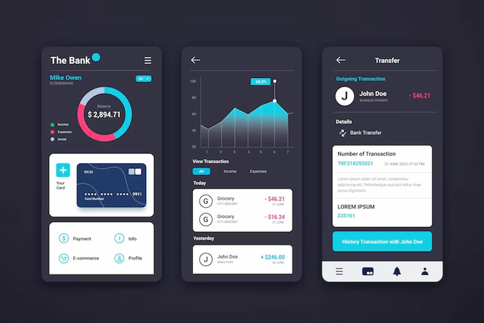
Clarity begins with focus. By making the most vital metric the dashboard’s centerpiece, users immediately gain context and can assess the current status of their accounts, projects, or data streams. In a budgeting app, for example, the total account balance is typically displayed at the top, while secondary information, such as recent transactions or category spending, appears below. This visual hierarchy supports rapid, informed decisions, reducing cognitive load and eliminating unnecessary guesswork.
Utilize Card-Based Layouts
Card-based arrangements bring structure to complex data displays. Each card acts as a container for a specific function or dataset, making it easier for users to process multiple streams of information without being overwhelmed. A weather dashboard might feature individual cards for temperature, humidity, and forecasts, allowing users to zero in on what’s most relevant. Cards can be reordered or dismissed based on user role or preference, enhancing both engagement and flexibility.
Design for Responsiveness
The proliferation of device types means a dashboard’s versatility must extend across a wide range of screen sizes, orientations, and hardware limitations. Responsive design uses flexible grids and scalable vector elements that maintain readability and usability, whether on a tablet in landscape mode or a phone in portrait mode. This ensures that vital data is always accessible and that the dashboard’s functionality does not degrade on less typical devices.
Incorporate User Feedback
The most meaningful dashboard refinements stem from continuous engagement with end users. Gathering feedback during beta tests, running A/B experiments, and inviting user comments within the app can uncover pain points and highlight desired features. This iterative approach ensures the dashboard not only looks good to designers but also delivers practical value to those it serves. Ongoing dialogue builds a sense of ownership and loyalty among users, making it easier to address shifting requirements over time.
Leverage AI for Personalization
Artificial intelligence can unlock new levels of customization for mobile dashboards. By tracking user interactions, preferences, and behaviors, AI-driven features prioritize the metrics that matter most to each individual. This might mean custom sorting of data cards or highlighting anomalies based on a user’s history. Personalized experiences create a stronger sense of relevance, reducing churn and improving satisfaction. As AI tools become more accessible, even smaller development teams can experiment with tailored dashboard experiences.
Ensure Accessibility
True innovation is inclusive. Designing for accessibility means considering users with different abilities, including those who rely on screen readers or need high contrast color schemes. Attention to font size, color contrast ratios, and sufficient tap targets is essential. Voice-over capabilities or alternative navigation options can further expand the dashboard’s reach. Incorporating these best practices supports legal compliance and demonstrates social responsibility.
Stay Updated with Design Trends
Innovation doesn’t stand still. By keeping abreast of emerging design tools and user experiences, designers ensure their dashboards remain modern and engaging. For example, Google’s new ‘Create My Widget’ initiative allows users to generate and customize widgets with simple natural-language commands, hinting at a future empowered by user-driven customization and AI assistance. Reading industry coverage, such as this TechCrunch article, helps teams spot influential shifts before they become ubiquitous.
Conclusion
Innovative mobile dashboard design is a dynamic process grounded in a deep understanding of user needs, data presentation, and technical possibilities. By prioritizing critical metrics, utilizing structured layouts, embracing new technologies, and regularly incorporating user feedback, designers can create dashboards that deliver both immediate answers and long-term satisfaction. A well-crafted dashboard not only informs but inspires, helping users meet their goals efficiently in a fast-changing digital landscape.